Typography -- AniType
Background
In this work, I wrote code to animate a simple graphic form, using a JavaScript template and a dynamic website–AniType, built for sharing such designs.
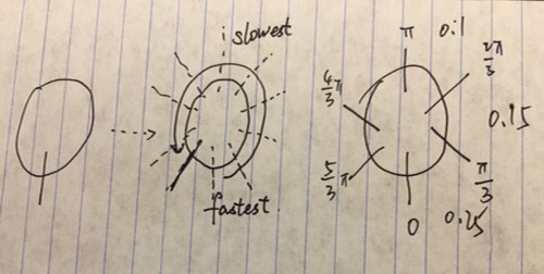
When I first started to choose letter to design, I just thought one of my initials should be the best — however, when I browsed letter Q’s gallery, I was surprised, that nobody used the circular feature to design their animation. That’s why I did the following scratch.

When I was implementing this design, it was occurred to me that the bar of letter Q just should not stay right in the middle. Then I changed the position of the bar to middle to the right.
Gallery

Here is the link to my letter Q design.